My zine can now be viewed on Issuu:
STRIX is ready!
Reply

My zine can now be viewed on Issuu:
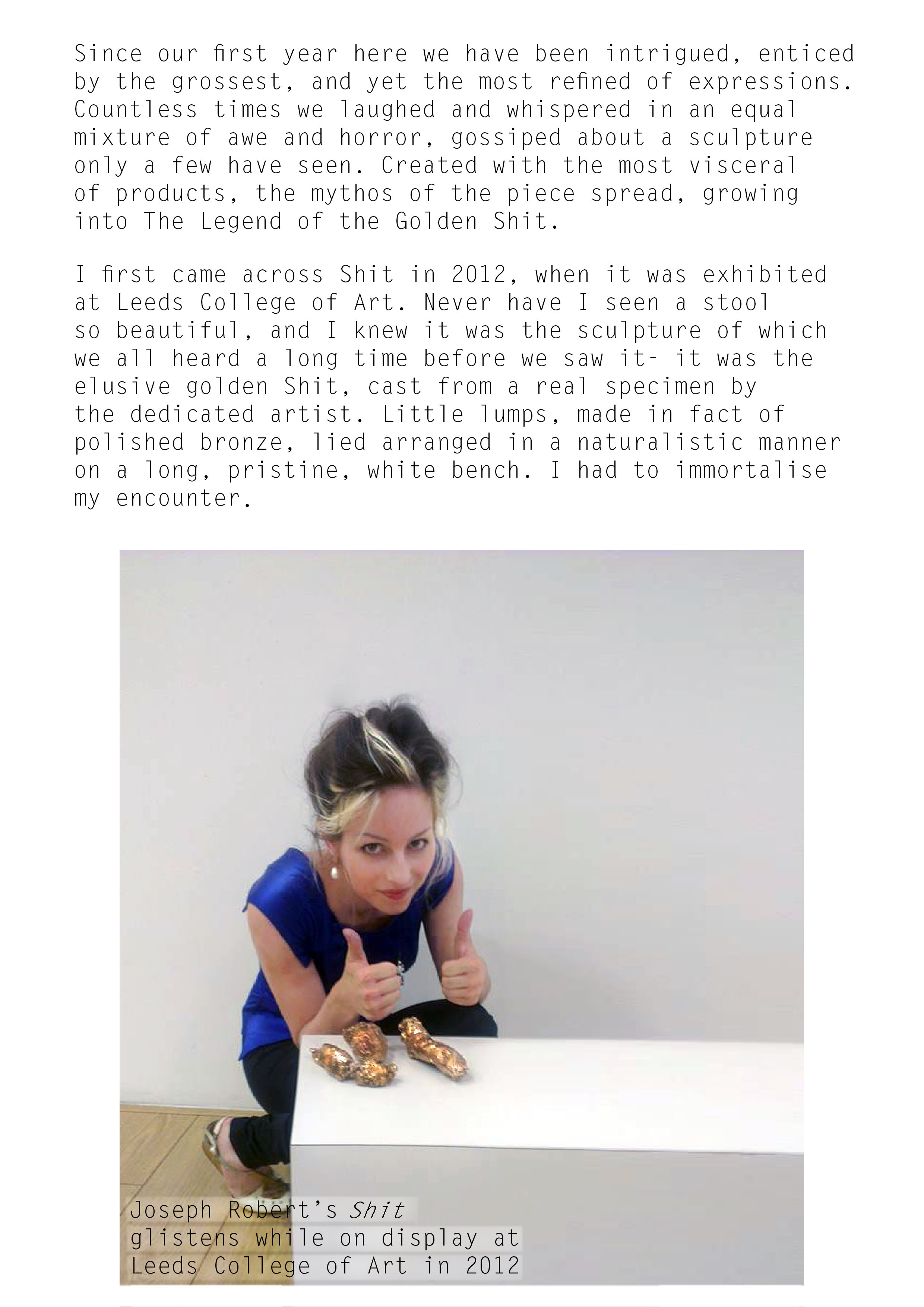
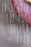
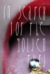
Joseph Roberts decided to be mmm ‘unprofessional’ and not speak to me about his sculpture, despite my efforts. I have proceeded with my plan of finishing the creative writing piece without interviewing the artist. The layout is minimalistic, in sync with the rest of the zine style.
 This amounts to the article spread looking like this:


The zine will be presented in a sleeve, for the purpose of presentation and protection. The zine would normally not be sold in a sleeve though, as this would completely obstruct the front cover, aiming to catch the viewer’s attention. I opted for a simple design of Strix’ black logo on plain white background. The sleeve will be open on the right hand side, allowing removal, and two slots will be incised into the spine, allowing the extended staples of the zine to be put through the sleeve and visible. The back of the sleeve will feature the same design as the front, but mirrored. I have proposed a few designs:


The design I chose to follow through with is number 2, as it reflects the branding’s placement throughout the zine itself. It is big enough to be appreciated for its linear quality and not overly big, leaving plenty of negative spacein the spirit of the trend of the minimalistic zines:
 Update- I decided not to put the sleeve on the zine, as the options of recycled card, 250 gsm were not available for the suitable price, after a botched order I received.
Although the most common and appropriate style of binding for an A4 zine of 24 pages would be saddle stitching, I decided to use loop stitch binding. This is mostly used for brochures intended to be put in three ring binders, which is not the purpose of the zine, yet the aesthetic effect is more uncommon and unseen when it comes to zines, and therefore would distinguish mine from others. Loop stitching is comparable to saddle stitching, but with a different effect. Loops are created with wire along the external spine, sticking out from it. I believe this little accent will be quite crucial to the overall look of the zine. I will use silver-coloured staples to bind the zine, as gold would not be in synch with the casual style of the cover photograph.


Update: I could not find a company that would loop bind my zine. Loop binding was only available for large quantities of orders. Single loop staples cannot be bought. I therefore decided to stick with saddle stitch binding.
Page 22 is the beginning of the creative writing session. It features an outlined early photograph of my encounter with the subject of my short essay. It features Letter Gothic Pro, the same font I used for throughout the zine for smaller lettering. It is simple, legible and modern. Page 23 is delayed, as Joe Roberts seems to have no phone on him at the moment and somehow doesn’t bother to reply to further emails. I plan, in case the artist doesn’t reply by Monday, to focus on Shit from the perspective mentioned before- losing the ownership of bodily substances.
Page 22:
Pages 20 and 21 serve as the intro to the creative writing section, as outlined in one of my previous posts. I undertook a few experiments with block colours for the left side of the spread, but it looked somewhat unprofessional, so I tried using fragments of related photos, which gave more professional results in High Fashion:


Page 20:

Page 21:

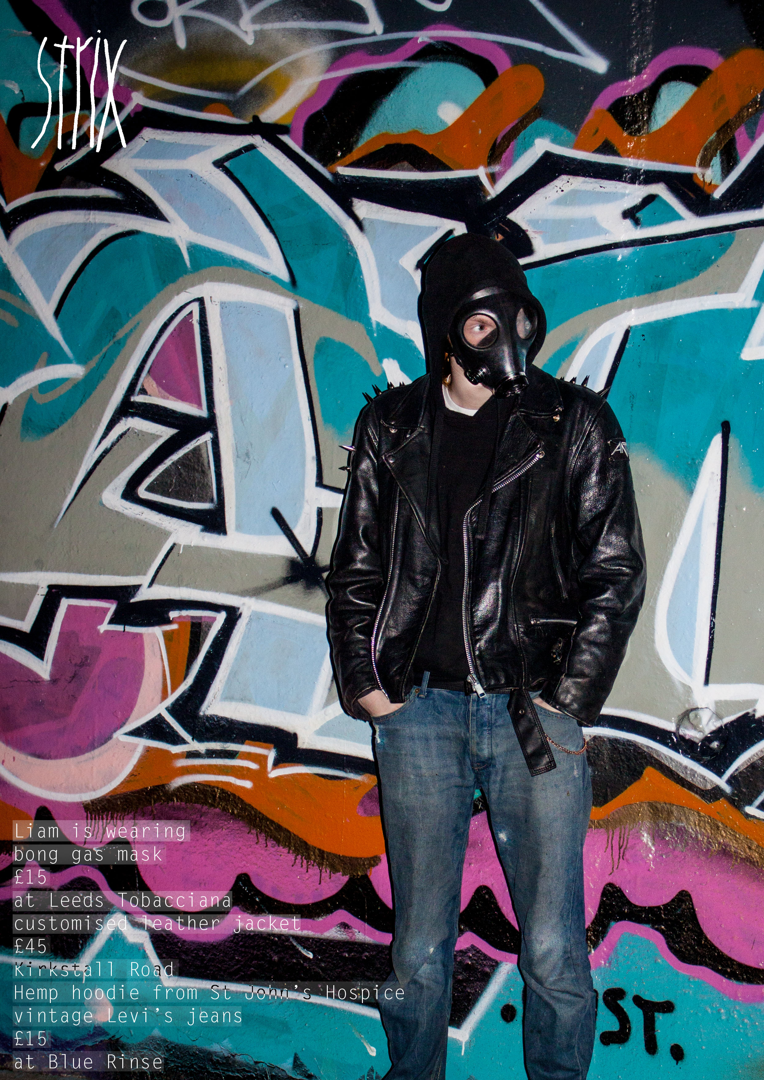
Using photographs obtained from the shoot outlined in one of my previous posts, I created page 18 and 19, for the good dose of strong juxtaposition after the High Fashion edit. The photos, although taking inspiration from sub style, are colourful enough to ensure they do not look ‘bleak’ compared with the relative luxury of garments presented in High Fashion. Lettering on the page 18 could possibly be made more legible, although I will need to ask for feedback in order to see whether its supposed illegibility is just my own impression, or whether is it a real flaw to be corrected:

I went for full photo pages, often visible in zines adhering to the current layout trends. I continued with this style to the end of the editorial:


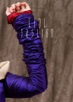
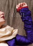
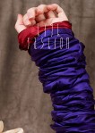
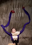
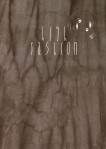
Page 10 is the title page for the longest editorial in Strix, featuring my Fashion Concepts and Innovation work, and a photoshoot I did as an alternative to the Harvey Nichols shoots in February. When it comes to FCI brief, the pieces I made got sold and rented out before the class got informed of the necessary use of those final pieces in the zine, so I opted for employing the photographs I took during the FCI finale, but did not use in the end. The shoot lasted for over four hours, leaving me with a range of suitable pictures. I originally intended to have the title page in one colour. I experimented with shades found in the background of the photograph I chose to be featured on the 11th page:


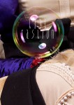
After putting the two pages together I was unhappy, and opted for trying a fragment of related imagery as the background of the High Fashion edit:


The final design for the page 10:

